Visualise Data
We provide four simple dashboards that might give you a better idea of the dataset. We plan to improve the usability of these dashboards and to include more functions in the future. You can download the graphs created with the dashboards as .pdf- or .png-file. You can find some methodological information regarding the selectable indicators at the bottom of this page.
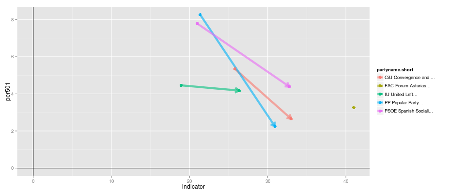
Dashboard 1: Election Scatter Plot
The first dashboard plots programmatic features or positions of parties in one country at a particular election. Additionally, it is possible to include data of the preceding election. Therefore, the dashboard provides programmatic information for a specific point in time or on changes between adjacent elections.
The graph below plots changes in parties' issue emphasis in Spain between the 2008 and the 2011 election. The y-axis shows parties' emphasis on environmental issues (per501). The x-axis indicates the emphasis on all economic issues (sum of per401 to per416). One can observe that most Spanish parties increased their emphasis on economic issues during the economic crises and decreased their emphasis on environmental issues.
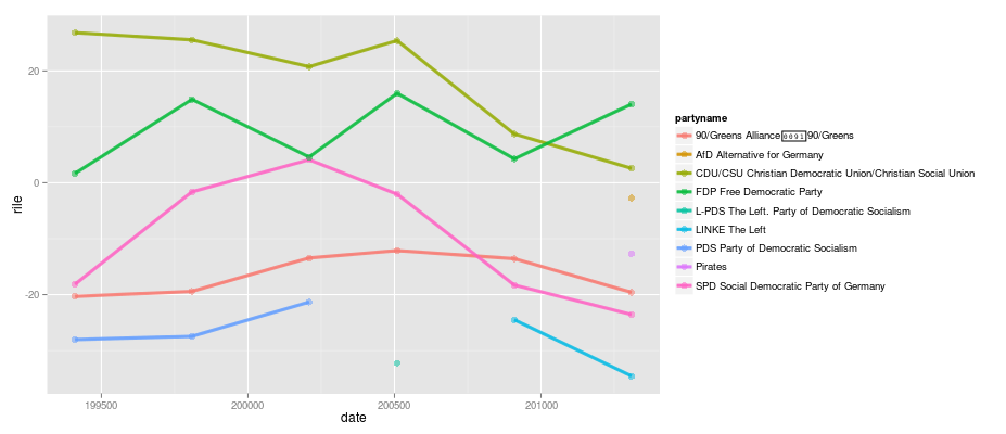
Dashboard 2: Parties over time
The second dashboard serves to plot programmatic features or positions of parties in one country during a selectable time period. Thereby, it provides information beyond two elections and shows programmatic trends over a longer time period.
The graph below plots the left-right positions of German political parties at national elections. The y-axis indicates the left-right position of a party according to the rile-index where higher positive values indicate a right-wing position and negative values a left-wing position. The x-axis indicates the time.
Dashboard 3: Cross-country Comparisons
The third dashboard plots country averages over parties' programmatic features and parties' positions for one or more countries during a selectable time period. Thereby, the dashboard allows you to compare programmatic trends in multiple countries over a longer time period.
Dashboard 4: Colored World Map
The fourth dashboard plots different programmatic indicators generated with MARPOR data throughout the world during a selectable time period on a world map. It can help to visualise programmatic emphases in different regions of the world.
Additional Notes for the Visualization Dashboards
Indicator Definitions and Scale Calculation Formulas
Information on most of the selectable indicators can be found in the codebook of the dataset. Several indicators of the dashboards are not integrated in the core dataset and thus are not explained in the core dataset documentation. These indicators are calculated as follows:
- Economy (State <-> Market):
(per401 + per402 + per407 + per410 + per414 + per505 + per507 + per702) - (per403 + per404 + per405 + per406 + per409 + per412 + per413 + per415 + per504 + per506 + per701) - Society (Progressive <-> Conservative):
(per601 + per603 + per605 + per608 + per704) - (per201 + per202 + per503 + per602 + per604 + per607) - European Integration (Salience):
per108 + per110 - European Integration (Position):
per108 - per110 - European Integration (Position ratio):
(per108 - per110)/(per108 + per110)
Changelog
- 2022-08-01 Updated economy and society scale calculation formulas. The previous formulas were as follows:
- Economy (State <-> Market):
(per401 + per402 + per407 + per414 + per505) - (per403 + per404 + per405 + per406 + per409 + per412 + per413 + per415 + per416 + per504) - Society (Progressive <-> Conservative):
(per104 + per109 + per601 + per603 + per605 + per608) - (per105 + per106 + per107 + per501 + per503 + per602 + per604 + per607 + per705)
- Economy (State <-> Market):
Visualizations by external researchers
- Tableau Visualization of the Manifesto Project Dataset: This online visualization by Michael Carpenter provides an intuitive approach to explore the Manifesto Project Main Dataset.